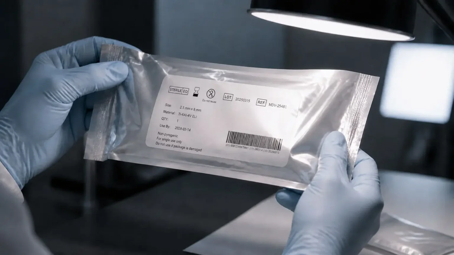

1 Legibility is not a property of the label alone
Font size, typeface, contrast and layout shape the label legibility on medical devices and packaging. From a human factors perspective, however, legibility only arises from the interplay of several factors:
- label and packaging design,
- printing and material properties,
- lighting conditions,
- viewing angle and distance,
- visual acuity and vision aids of the users,
- available time and parallel tasks,
- prior knowledge and expectations regarding the information being sought.
Label legibility is therefore a sub-area of packaging usability. A basic classification of packaging as part of the user interface can be found in the article Usability evaluation of medical device packaging. This article addresses one section of it: the question of how the recognizability of information can be investigated realistically.
Labeling is part of the user interface: the FDA Human Factors Guidance explicitly names packaging, labeling and training materials as examples in its definition of the user interface, and in usability engineering according to IEC 62366-1, accompanying information is also considered together with the product. The IMDRF principles of labeling likewise require that the medium, format, content, legibility and position of the labeling suit the device, its purpose and its users.
In addition, ISO 20417 specifies which information the manufacturer must provide, and ISO 15223-1 specifies which symbols are used on the labeling of medical devices. Both standards describe what belongs on a label and how symbols are to be used. Whether the information is actually found and understood in the context of use is only shown by the usability evaluation.
A label can be clearly recognizable under controlled conditions and still be overlooked or misinterpreted in the context of use. Particularly susceptible are glossy surfaces, low contrast, small print, visually similar product variants and information that only becomes visible when the packaging is turned.
The question is not “Is the label legible?”, but: “Does the intended user group find and understand the relevant information in time under the foreseeable conditions?”
2 Why lighting conditions make the difference
Light does not only affect whether characters are visible. It also changes information search, color recognition and the differentiation of similar design elements. Relevant influencing factors include, for example:
- reduced ambient lighting,
- directional light and cast shadows,
- glare and reflections on films or coated surfaces,
- different color temperatures,
- changes between bright and dark areas, for example between a display and the surroundings.
Which conditions belong in a test follows from the context of use and the disturbing factors of the use environment. Packaging for a brightly lit preparation room places different demands than a product used in a darkened examination room, in an emergency response or in the home environment.
2.1 User group and vision conditions
Light does not affect all users equally. How well information is recognized under reduced lighting or glare also depends on visual acuity. Vision aids, protective glasses or visors can change the field of view and contrast perception. For products intended for home use, lay users with very different visual acuity are added.
These differences belong in the description of the intended users and in the user profile. They determine which participants are needed for a readability test and which aids are permitted in the test. A test that is conducted only with participants with very good visual acuity and without protective equipment underestimates the difficulties in everyday use.
Change of perspective
In a project, a label is usually released on screen or on a printout at a desk. It is used in a completely different situation: with the product in hand, wearing gloves, under time pressure and with attention on the next task. The release situation is therefore no substitute for the context of use.
3 Four levels of legibility
To make clear where a difficulty arises, four levels should be observed separately in the test.
3.1 Visual perceptibility
Can users perceive characters, symbols, colors and boundaries? Influencing variables are font size, stroke width, contrast, surface reflection, print quality, distance, angle and illuminance. The wiki entry Perception describes the fundamentals.
3.2 Findability
Do users find the information they need? Information hierarchy, grouping, position and visual anchors count here. An item can be easily legible and still not be found because it is located in an unexpected place.
3.3 Distinguishability
Can similar product variants or items of information be reliably told apart? This is particularly important when the packaging of a product family is structured identically and differs only in color, abbreviation or small parts of the text.
3.4 Comprehensibility
Do users understand the information they have found as it is intended? Purely text-based methods, which evaluate word and sentence lengths, for example, give indications of linguistic complexity. However, they do not show whether users implement information correctly in a specific situation.
Why the separation matters
If the four levels are not recorded separately, it remains unclear whether a problem arises from poor visibility, from the information architecture or from a comprehension problem. The design measure is then guessed rather than justified.
4 What can be investigated formatively
A formative usability evaluation is intended to identify weaknesses early and improve design solutions. Typical questions for labels are:
- Which information do users look at first?
- Is safety-relevant information found in time?
- Which items of information are overlooked under reduced lighting?
- Do reflections or glare occur that prevent reading?
- Are similar variants confused?
- Does the search strategy change under different light?
- Which information is found but misinterpreted?
Compensation strategies are particularly revealing. When participants turn a package several times, bring it closer to their face, hold it up to the light, use a lamp or ask others for help, this shows potential for optimization, even if the task is solved in the end.
In our readability tests we see this behavior again and again: participants turn the packaging, bring it closer to their eyes or hold it up to the light before they find the information they are looking for. This is exactly where the root cause analysis begins.
4.1 When to test in the development process?
A readability test is worthwhile as soon as the layout and information hierarchy of a label are fixed, but print data and packaging material can still be changed. Early on, printouts on the intended material or simple samples are often sufficient. Later, near-series samples with the original surface should be tested, because gloss, film and printing process strongly influence reflection. A second, shorter round after design changes shows whether the measures work and no new problems have arisen. A test is also useful when a product family is extended by new variants, because the risk of confusion then increases.
5 A possible study design
5.1 Analyze the context of use
Before selecting the lighting conditions, clarify: Who uses the product, where and at what time? Which information must be recognized then? Which use errors or delays could occur? Not every conceivable lighting situation has to be simulated. The selection should be derived from the context of use and the use-related risk analysis, for example from the hazard-related use scenarios.
5.2 Define information tasks
Instead of asking whether a label is legible, formulate concrete tasks, for example:
- Identify the required product variant.
- Find the size specification.
- Locate the warning notice.
- Distinguish between two similarly designed variants.
- Determine the next action step.
Task-based tests show whether the labeling supports actual use.
5.3 Vary lighting conditions in a controlled way
Depending on the context of use, several defined conditions can be investigated, for example reference lighting, reduced lighting, directional light, unfavorable incident light with reflection and the change between a bright and a dark environment. The conditions should be documented and reproducible. In addition, viewing angle, distance and available time can be varied.
We conduct such readability tests in our Medical Usability Test Lab. The lighting there can be adjusted from complete darkness to operating room lighting. This allows us to recreate both darkened examination and patient rooms and brightly lit procedural situations, and to keep the conditions the same for each session.
DIN EN 12464-1 can serve as a guide for realistic lighting levels. The standard describes requirements for the lighting of indoor workplaces, including areas in healthcare. Decisive for the test, however, remains the specific context of use of the product.
5.4 Capture behavior instead of opinion
Statements such as “I could read that well” are helpful, but should not be the only data source. More meaningful are observable data: time to find the information, area looked at first, repeated searching, turning or tilting of the packaging, shortened distance, confusions, omitted information and the success rate per information task. The think-aloud method can additionally show what participants are looking for.
5.5 Debrief on causes
Ask specifically after each task: What was difficult to recognize? Where was the information expected? What helped, what distracted? Was the difficulty visual, linguistic or structural? The goal is not a list of preferences, but a traceable link between context of use, observed behavior and design cause, that is, a root cause analysis.
5.6 Select participants
A formative readability test does not require large samples, but it does require the right participants. They should represent the intended user groups, including typical vision aids and, where relevant, the protective equipment worn in the context of use. Also include participants with different lengths of professional experience. Experience can influence how information is searched for, for example whether someone relies on familiar positions and colors or reads the label completely. More on selection can be found in the wiki entry Representative users.
5.7 Document test conditions
So that results are traceable and later iterations are comparable, the conditions should be recorded for each session: illuminance at the label, type and position of the light sources, color temperature, viewing distance and angle, and the prototype or print status used. Photos of the setup from the participants’ point of view help with later root cause analysis. This documentation is also the bridge to the summative evaluation: it shows which conditions have already been investigated and which still have to be covered there.
| Classic approach | New approach |
|---|---|
| Check the label in the office on screen or on a printout | Test the label in the context of use under defined lighting conditions |
| Question: “Can you read this?” | Concrete information tasks with an observable outcome |
| Legibility as one attribute | Perceptibility, findability, distinguishability and comprehensibility separately |
| Satisfaction rating by the participants | Behavior, compensation strategies and errors as the main data |
| “Fixing” individual problems directly | Analyze the cause, adapt the design, investigate again |
6 What a formative readability test can and cannot do
A formative test can make weaknesses visible early, compare design variants, identify problematic lighting and viewing situations, support the use-related risk analysis and make requirements for the later summative evaluation more concrete.
However, it is not conclusive proof. Especially with small samples or non-final prototypes, no general statements about the usability of the final product can be derived. The communication of results should reflect this clearly: the formative evaluation identifies possible weaknesses and supports design decisions. It does not prove that a label is safely legible under all lighting conditions.
For the regulatory classification, the distinction is important: IEC 62366-1 distinguishes formative evaluations, which iteratively improve the design, from the summative evaluation, which demonstrates safe use on the final design. Questions about the legibility of safety-relevant labeling that remain open formatively should therefore flow into the planning of the summative evaluation as concrete tasks or knowledge questions.
For product and development teams, early testing is worthwhile mainly for one reason: confusion of similar variants or late label changes shortly before the summative evaluation or market launch cost time, because print data, packaging and documentation have to be adapted again.
7 From observation to design decision
The value of a formative evaluation only arises through its translation into measures. Possible measures are higher contrast, adjusted font size or stroke width, less glossy surfaces, a different prioritization and grouping of content, critical information on several visible surfaces, stronger differentiation of similar variants, color coding with additional features and clearer symbols.
Do not correct every observation in isolation. Changes create new interactions. A larger font can improve legibility and at the same time change information density and hierarchy. An iterative sequence has proven effective: observe, analyze the cause, adapt the design, investigate again.
A simple matrix helps to translate observations into measures in a structured way:
| Observation | Possible cause | Possible measure |
|---|---|---|
| Information is overlooked under reduced light | Contrast or stroke width too low | Increase contrast, adjust stroke width |
| Participants tilt the packaging several times | Reflection on glossy surface | Matte surface in the information area, change position |
| Variants are confused | Difference only through color or abbreviation | Additional distinguishing feature (shape, symbol, text size) |
| Information is found but misunderstood | Term or symbol ambiguous | Revise wording or symbol, check comprehension again |
| Long search time despite good visibility | Information in an unexpected place | Adapt information hierarchy and grouping |
Each row is a hypothesis that is verified in the next round.
Quick check: 7 questions before the readability test
- Have user groups, vision conditions and vision aids been considered?
- Have the critical information tasks been defined?
- Are the lighting conditions derived from the context of use and the risk analysis?
- Are reflections, angle and distance taken into account?
- Are perceptibility, findability, distinguishability and comprehensibility recorded separately?
- Are behavior, compensation strategies and confusions observed and not only asked about?
- Are the conditions documented reproducibly, and is it defined how results are translated into design requirements?
Conclusion
Labels are not static carriers of information, but part of the user interface. Whether labeling works depends not only on font size, contrast and mandatory information, but on whether relevant information is found, distinguished and understood under realistic conditions.
Formative readability tests under varying lighting conditions make exactly this interaction visible early. They create a robust basis for design decisions and for planning the summative evaluation.
In the Medical Usability Test Lab of USE-Ing., we investigate labeling and packaging under defined lighting conditions and translate observations into concrete design requirements. If you would like to test a label realistically before release, get in touch with us.
A label must not only be visible. It must work at the right moment, under the actual conditions and for the intended user group.
Frequently asked questions about label legibility
Further content
- Usability evaluation of medical device packaging
- Formative usability evaluation according to IEC 62366-1
- Hazard-related use scenarios and use-related risk analysis
- Wiki: Labeling, Packaging usability, UDI, ISO 20417
Sources
- IMDRF/GRRP WG/N52 FINAL:2024 (Edition 2): Principles of Labeling for Medical Devices and IVD Medical Devices, April 26, 2024, Section 5.1.1: imdrf.org (PDF)
- IEC 62366-1:2015+AMD1:2020 / DIN EN 62366-1, Medical devices, Part 1: Application of usability engineering to medical devices: https://www.dinmedia.de/de/norm/din-en-62366-1/338440028
- FDA: Applying Human Factors and Usability Engineering to Medical Devices: https://www.fda.gov/regulatory-information/search-fda-guidance-documents/applying-human-factors-and-usability-engineering-medical-devices
- ISO 20417:2021, Medical devices, Information to be supplied by the manufacturer: https://www.iso.org/standard/67943.html
- ISO 15223-1:2021, Medical devices, Symbols to be used with information to be supplied by the manufacturer, Part 1: General requirements: https://www.iso.org/standard/77326.html
- DIN EN 12464-1:2021, Light and lighting, Lighting of work places, Part 1: Indoor work places: https://www.dinmedia.de/de/norm/din-en-12464-1/334047306